TEL 13120989195
-
position: HOME > NEWS CENTER > Company news
Look,the huge paper crane landed on the booth!
Time:2023-10-26 16:38:41
Author:小编
Clicks:
This is a landing project from the CIIE before,but it suddenly flipped over yesterday and I still find it very interesting
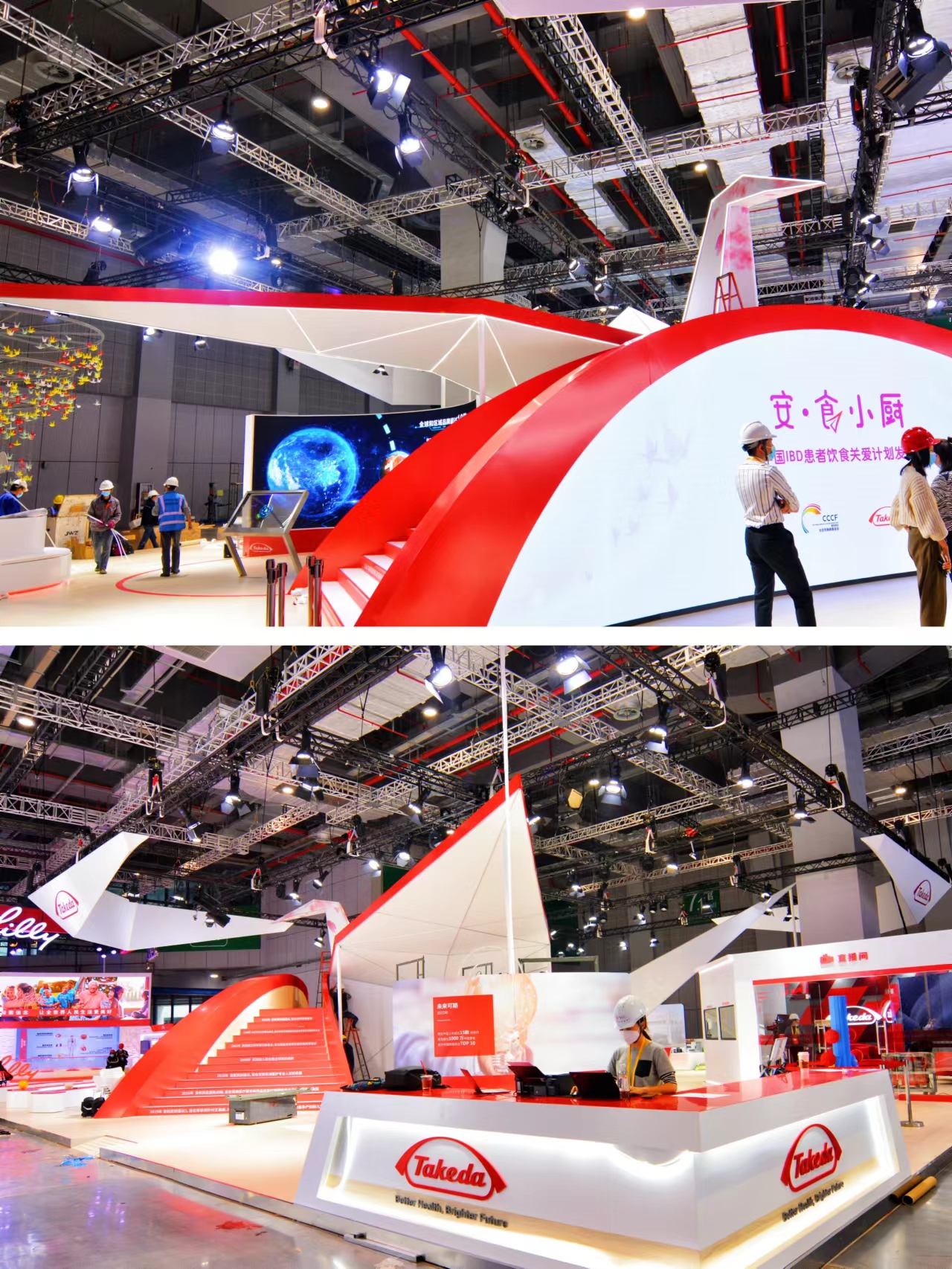
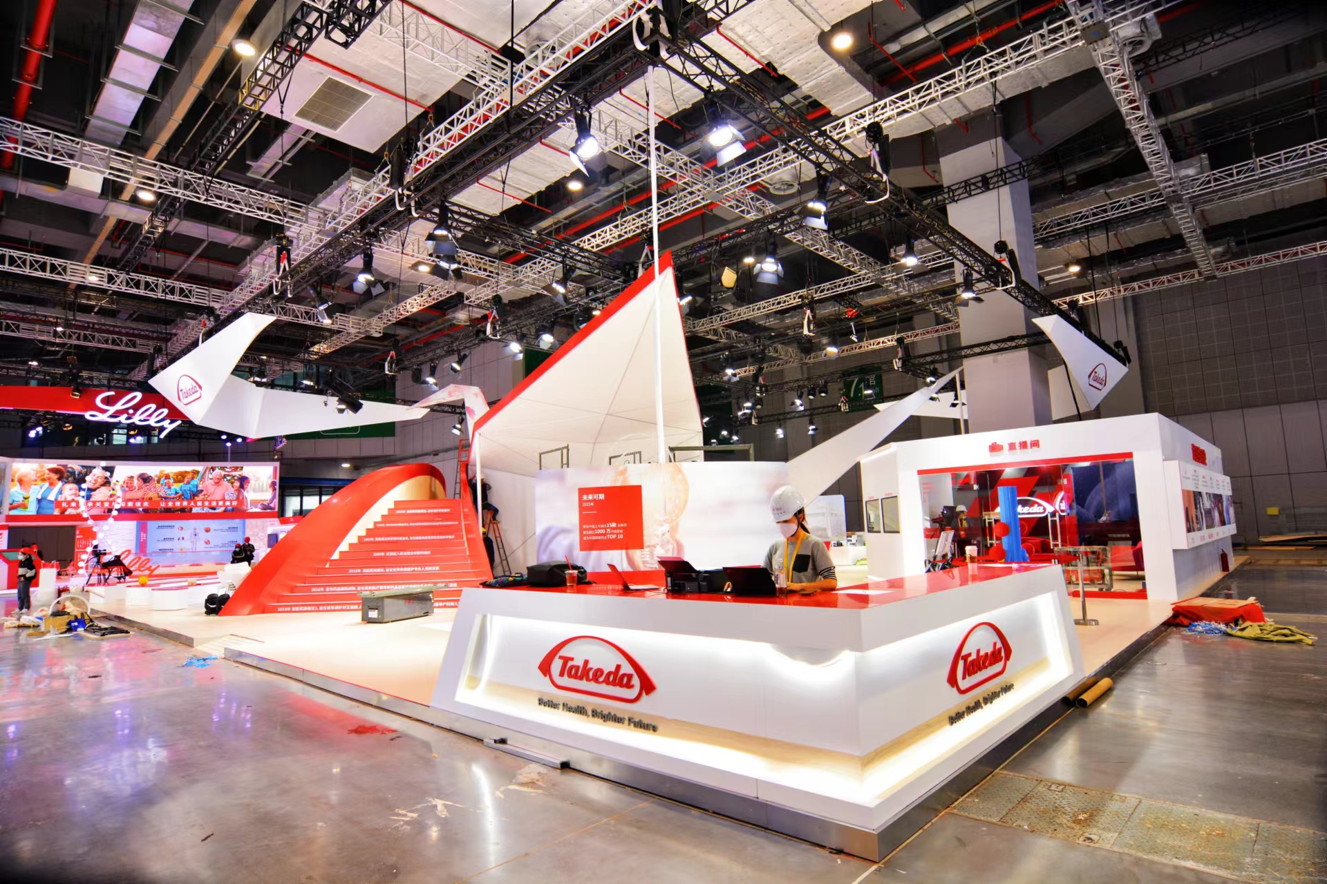
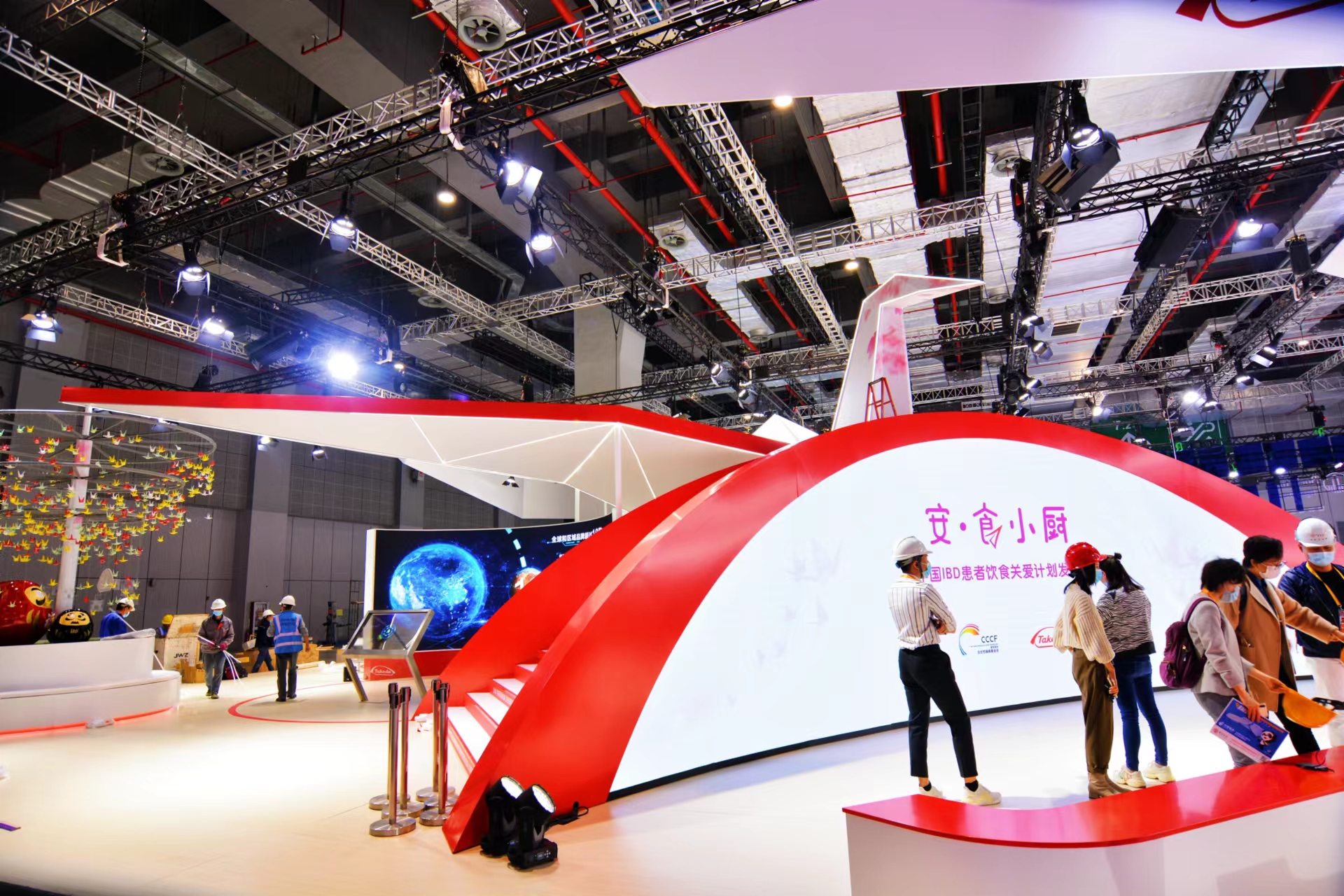
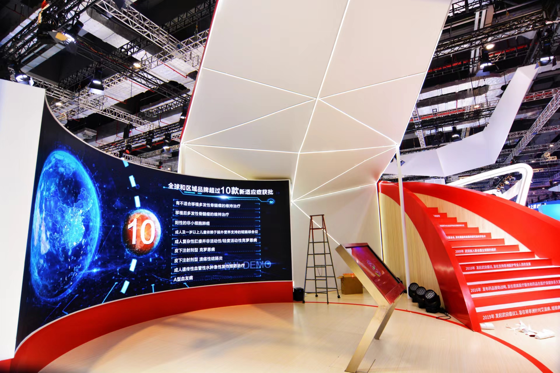
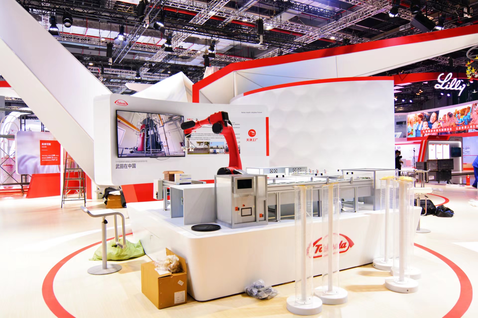
The booth did not follow the traditional design,but instead used the entire space as the landing site for the Thousand Paper Cranes.
The body of the Thousand Paper Crane adopts the corporate logo color of red and white
In front of the crane,an arch bridge has been designed that can be used for check-in,which can mobilize the human body and leave a deep impression.Under the crane's wings,there is a multimedia screen used for display and promotion
Overall,it is both creative and has complete display functions
Caught the attention of many people on site
keyword:
- Previous: Shenzhen International Furnitu
- Next: Key points for green and envir

