-
position: HOME > NEWS CENTER > Company news
Hexagonal Warrior|Feast of Books,Power of Knowledge
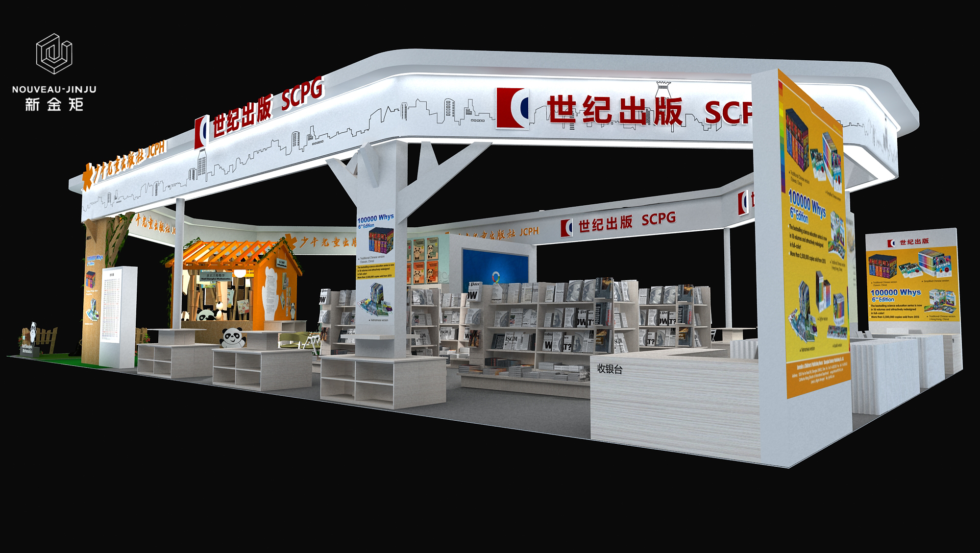
Project Name:Children's Book Exhibition·Century Publishing·Booth Design
Coordinates:Shanghai
Project type:exhibition design,booth design,exhibition beauty display
Display style:simple and atmospheric
Theme color tone:white
Design Description:
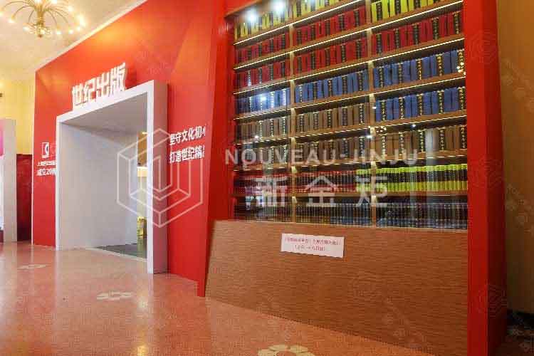
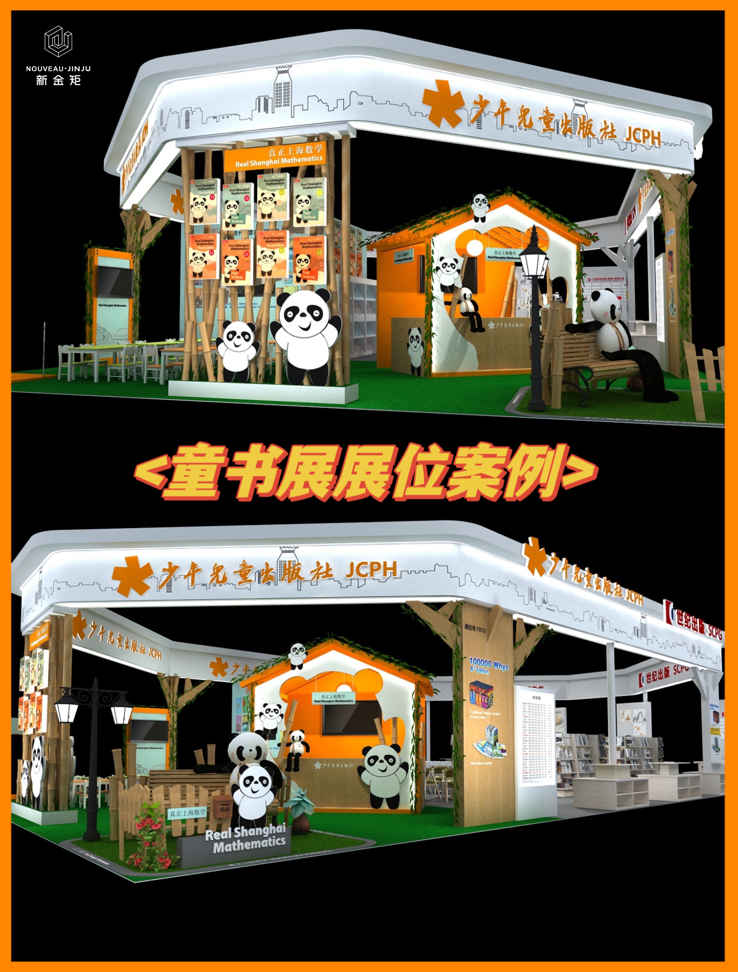
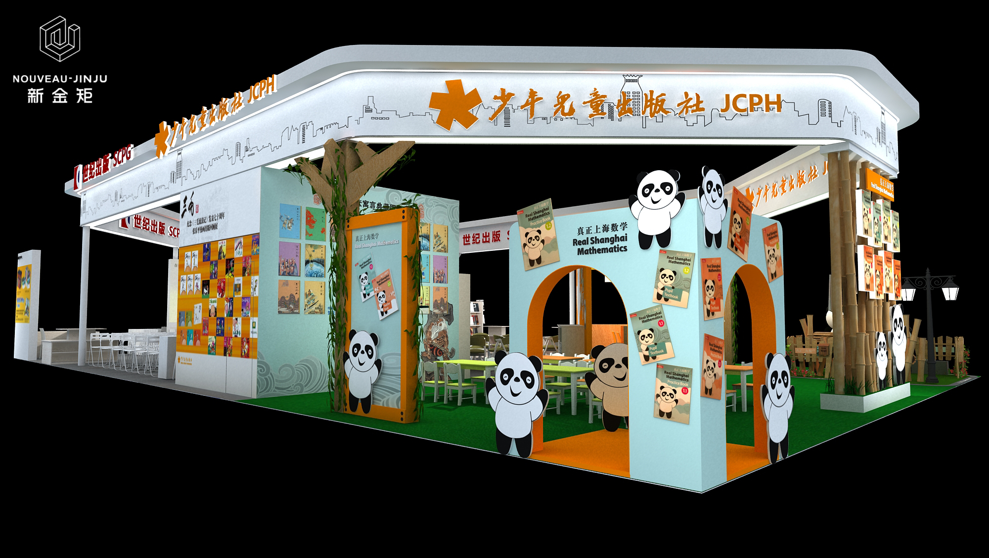
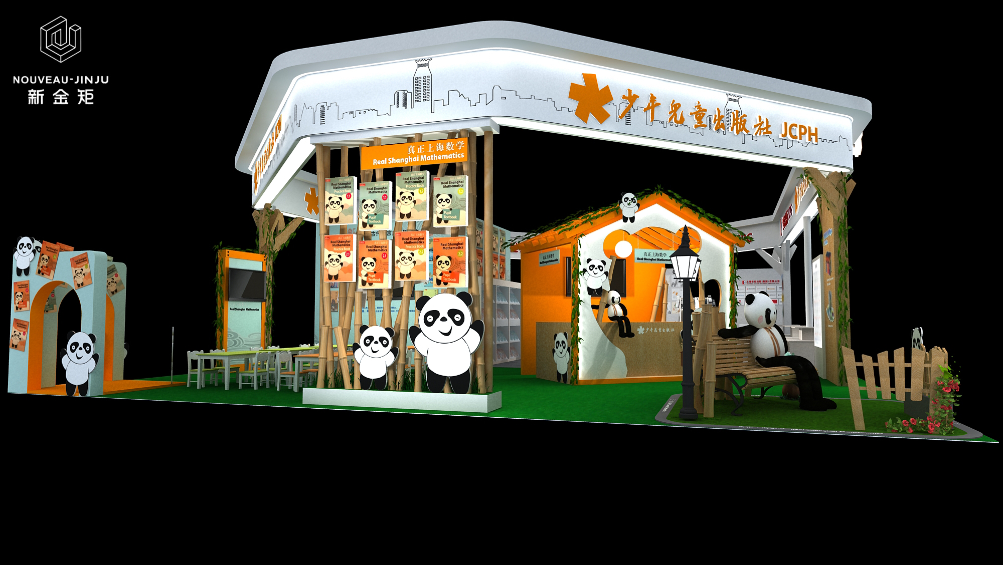
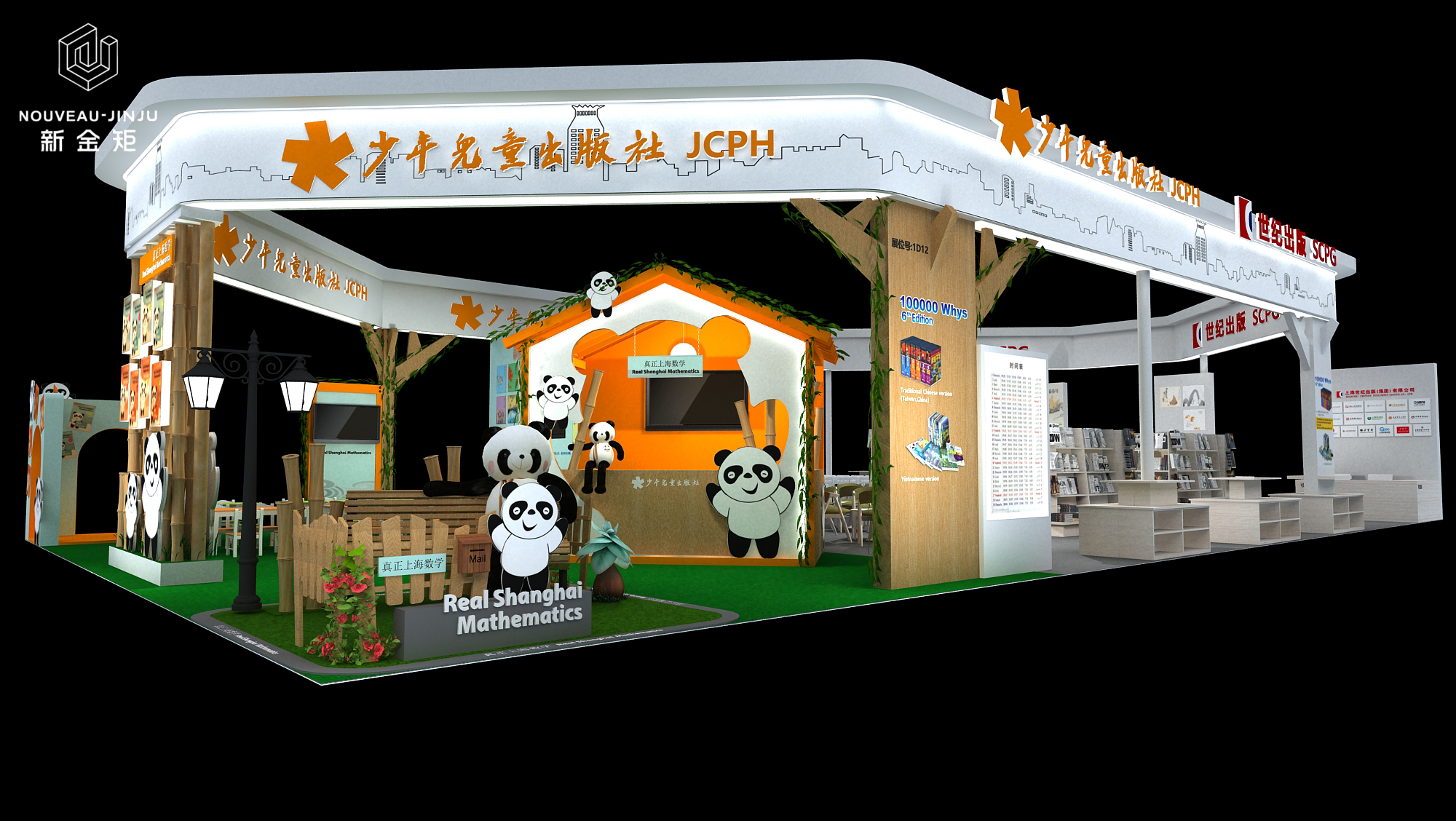
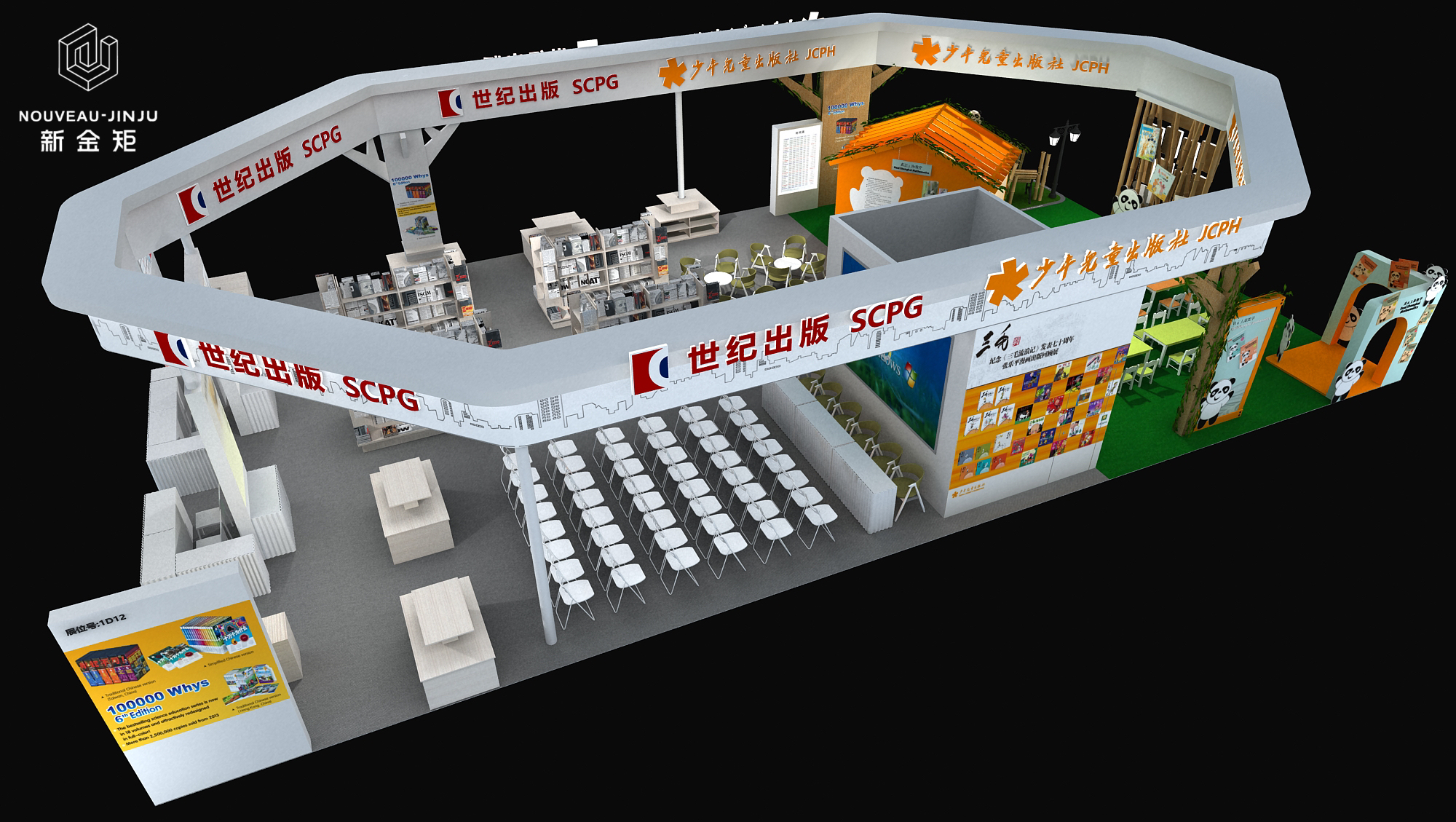
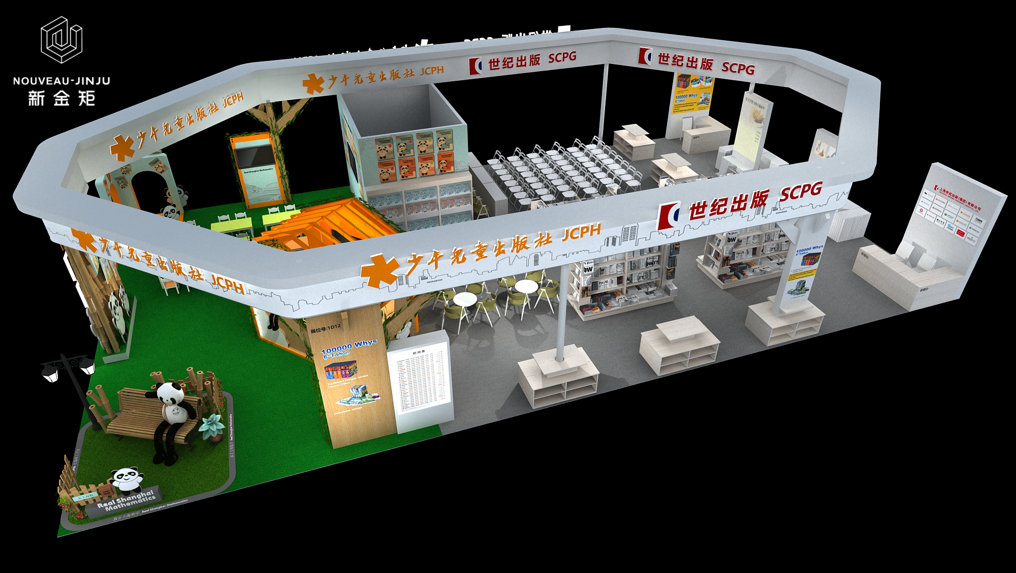
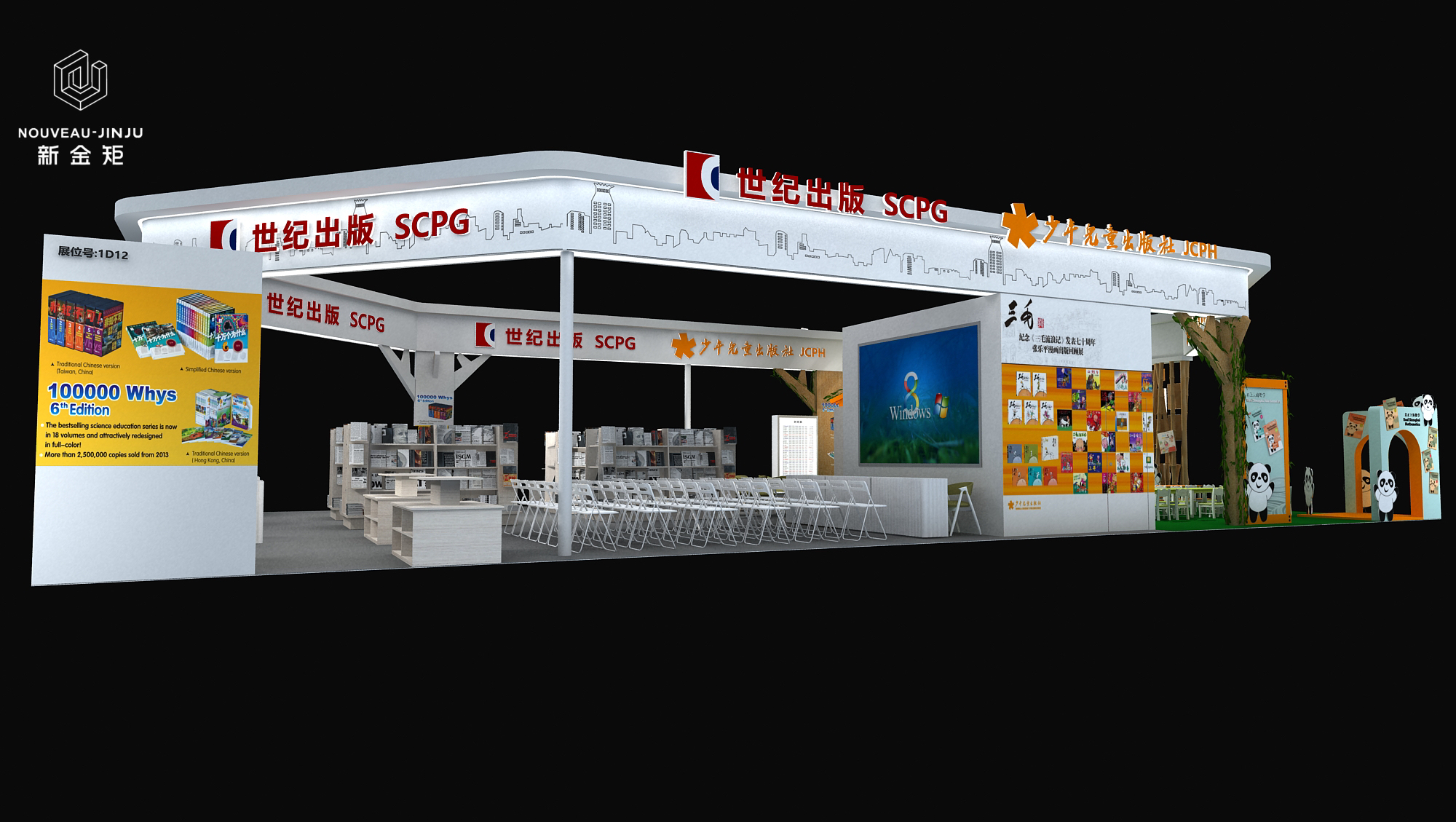
The design of this booth is mainly white,supplemented by orange and red.Century Publishing and Children's Publishing are divided into two,with a hexagonal frame as the overall framework,each accounting for half.The two styles reflect different exhibition themes.We hope to create a comfortable,natural,and enjoyable reading space for visitors through innovative design techniques.The internal space planning of the exhibition hall fully considers the children's experience and exploration desire.We have set up multiple theme areas,including exhibition area,speech area,children's reading area,rest area,etc.These areas not only allow children to learn knowledge while playing,but also allow them to experience the charm of books while reading.Our design also fully embodies the concept of environmental protection,and we also pay attention to environmental protection and sustainability in material selection,striving to create a safe,healthy,and green exhibition environment for children.
- Previous: Case|Constructing a Simplified
- Next: Battery Show|Cool Royal Blue B

