TEL 13120989195
-
position: HOME > NEWS CENTER > Company news
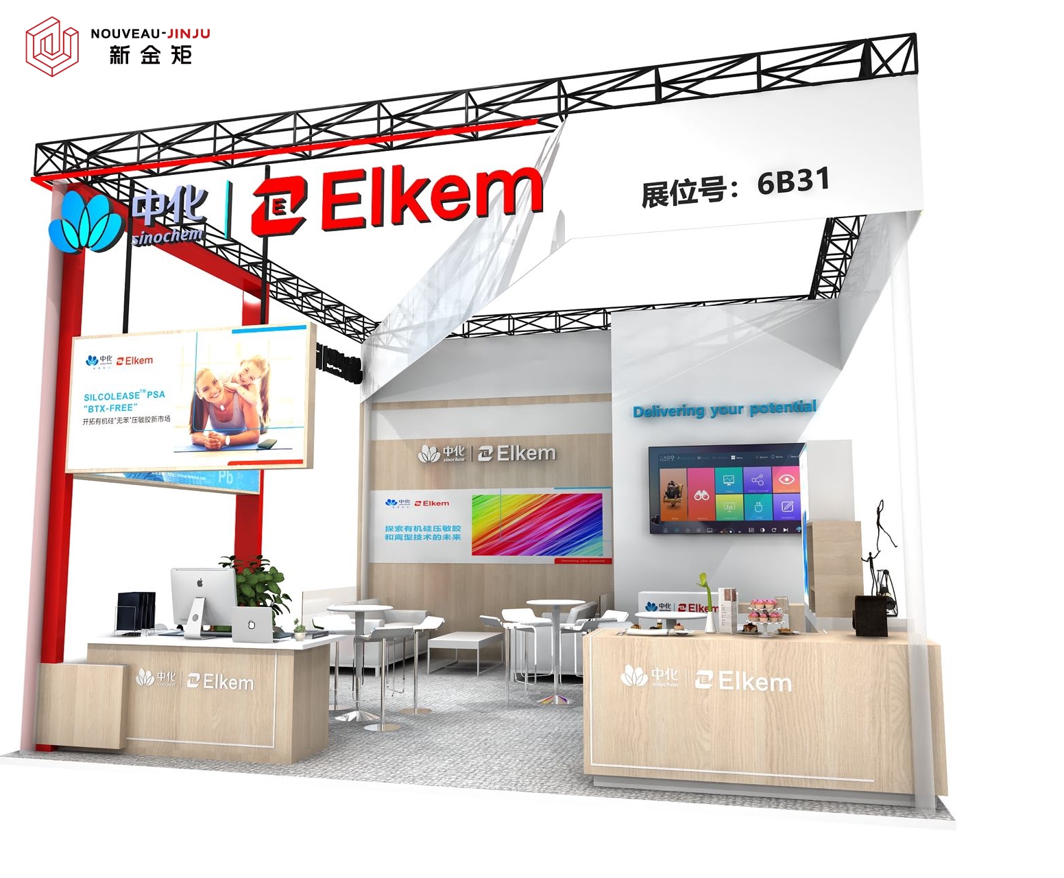
Case | A Little Red in Simplicity, A Trick to Break Space Restrictions
Time:2023-10-12 14:28:55
Author:小编
Clicks:
Xiao Qiaosi
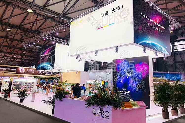
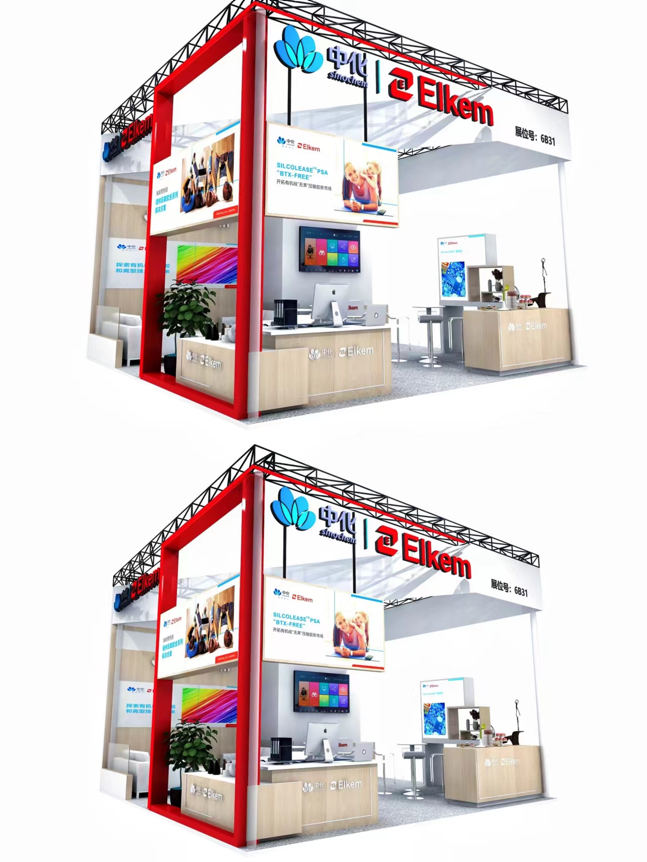
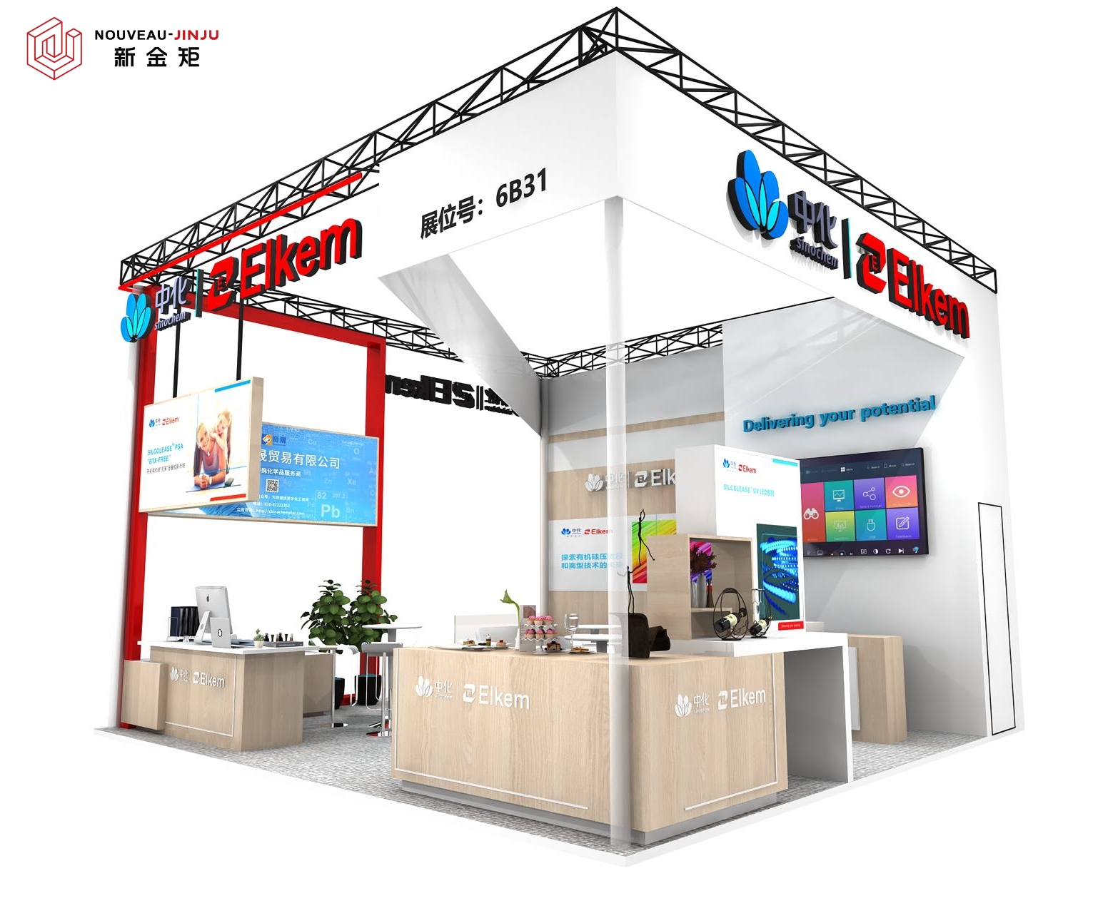
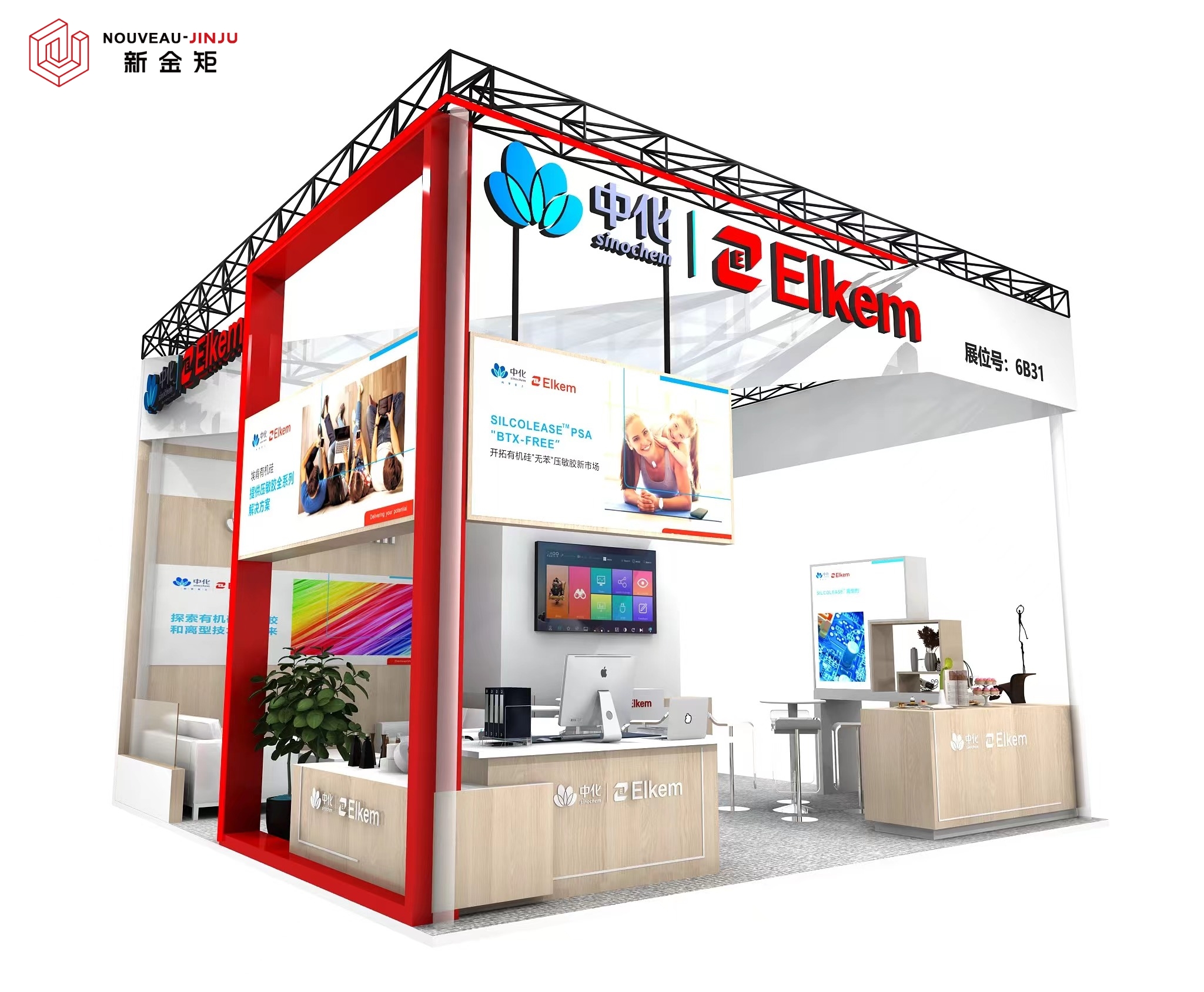
This design features a three-dimensional corporate logo hanging below the truss,as well as an exhibition board.The exhibition surface does not use walls,which can enrich the spatial hierarchy and enhance visibility!
The color is chosen as white as the main tone,with red as the embellishment for the borders and fonts.
Simplicity without losing vitality
keyword:
- Previous: You may not believe it!Many pe
- Next: Xi Da Pu Ben | New Jin Ju Bo H

