-
position: HOME > NEWS CENTER > Company news
Case 1: Long Corridor Style! Moving reading space into booth design
Design style:modern and atmospheric
Main color tone:blue,white
Design Description:
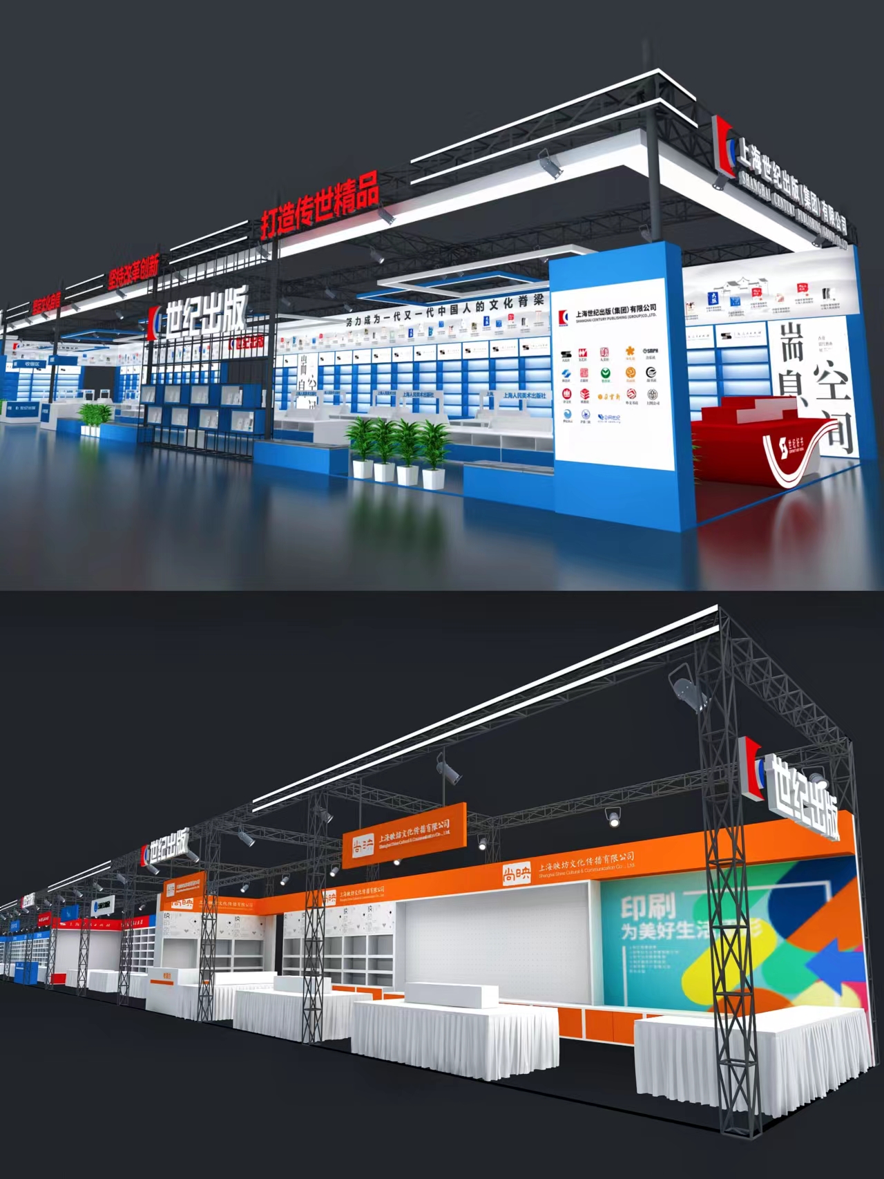
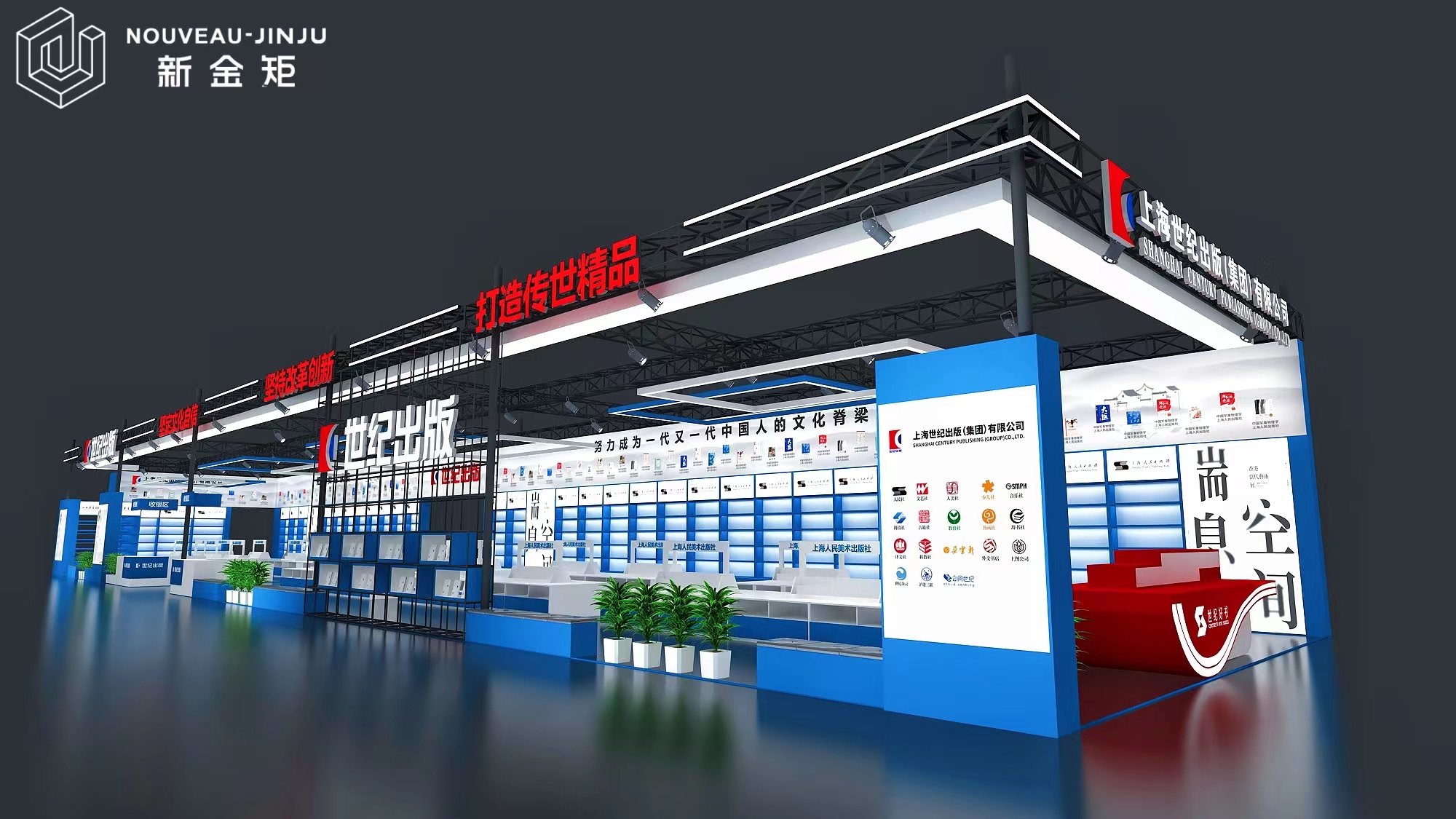
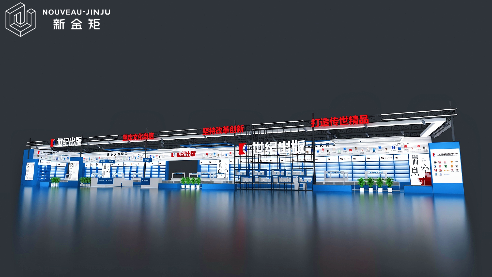
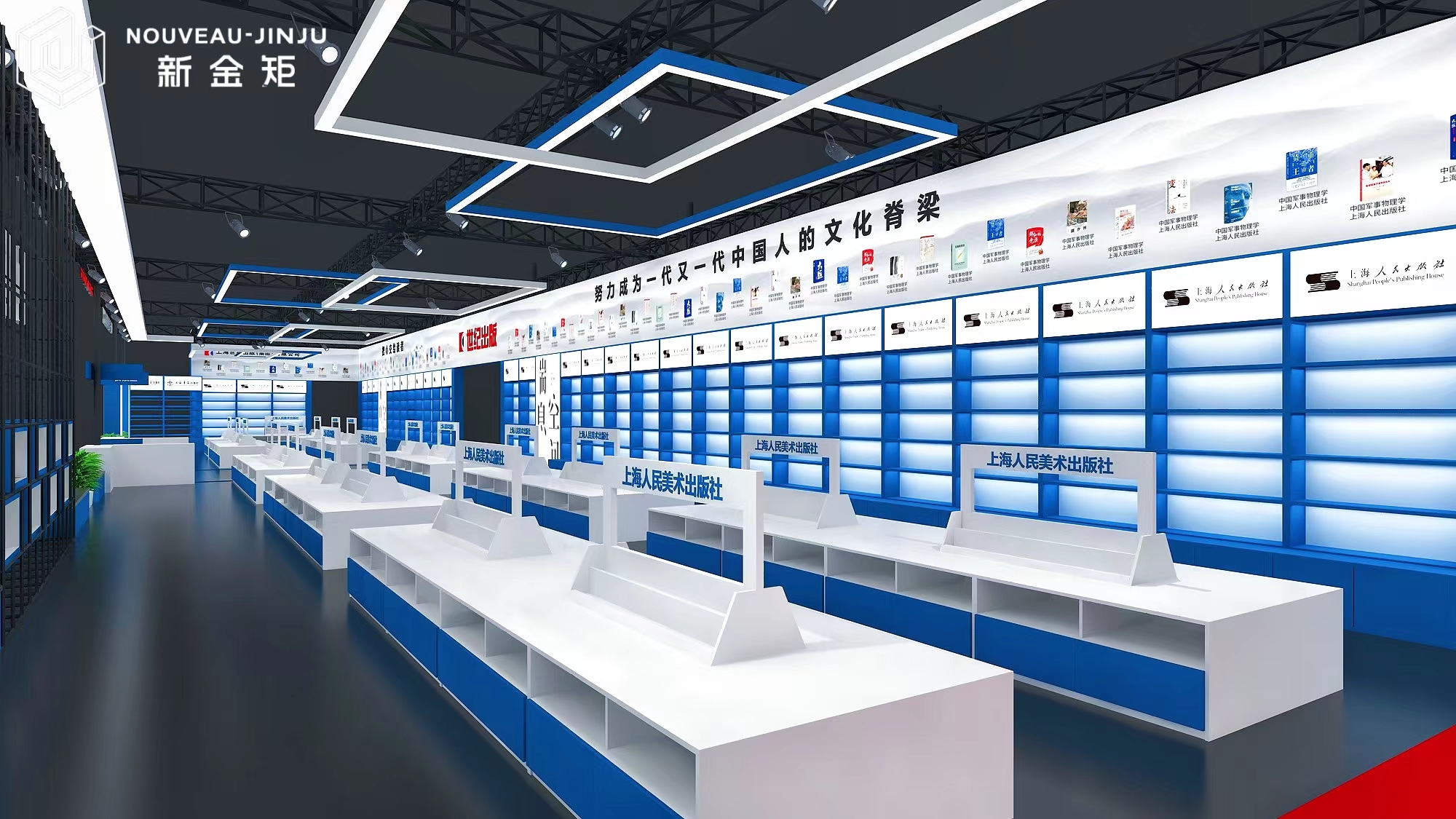
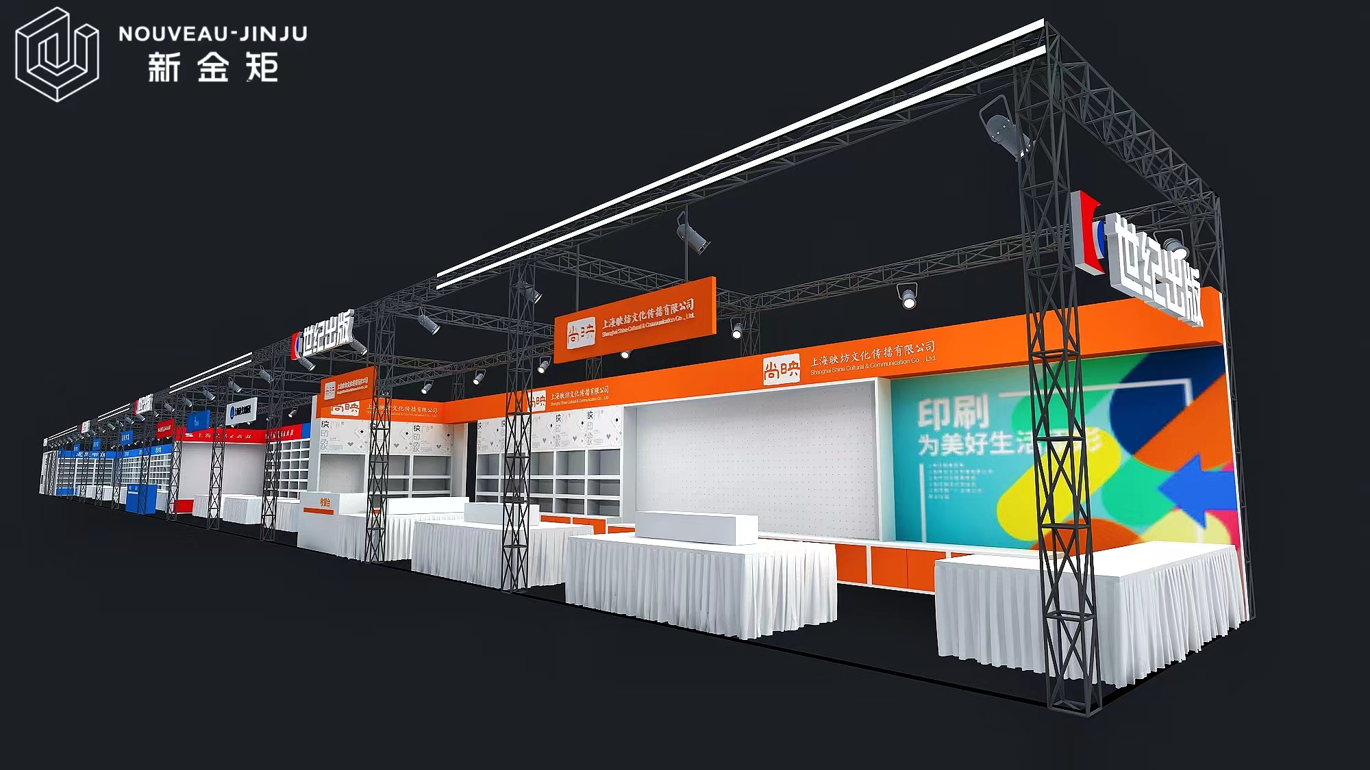
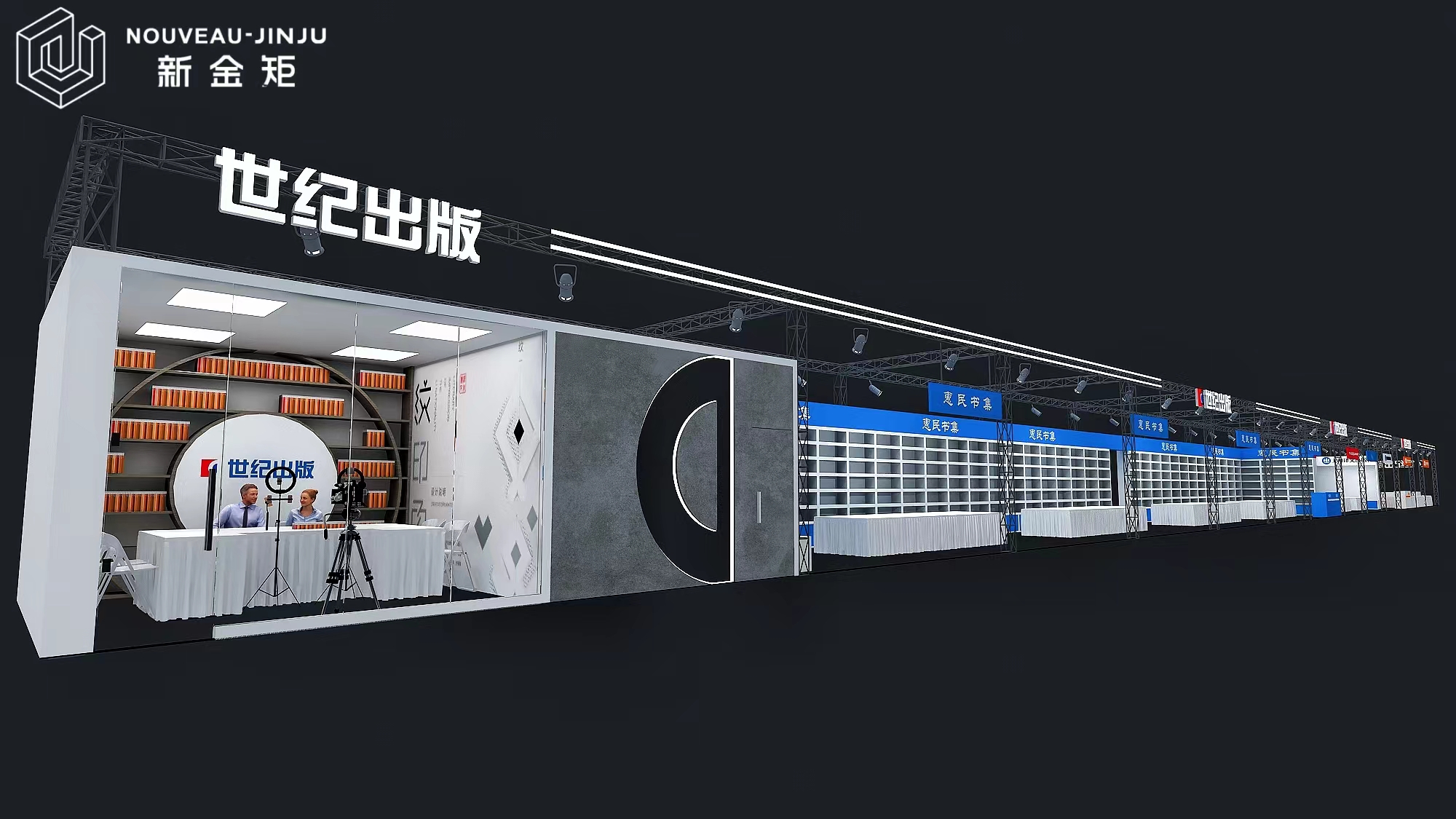
Combining spatial characteristics to create distinctive corridors
Based on the characteristics of the space and the characteristics of the enterprise,we will create a reading corridor for Century Publishing House,with a semi open design,to give the space as much as possible to the book and audience.
Color highlights
The top red slogan showcases the development concept of the enterprise,which is eye-catching and impressive.The bottom theme space is made of blue and white colors,combined with modern multimedia,which is simple and elegant.
Function settings
Leave the exhibition wall as much as possible for the exhibits-books,and provide leisure tables and chairs as much as possible for the remaining space to retain the audience.The main exhibition information will be presented through multimedia.
- Previous: Asian Games Diary | New Jin Ju
- Next: Booth Design|How to Design Sma

